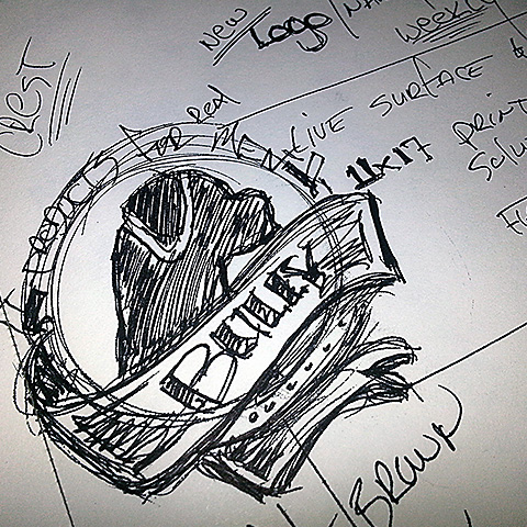
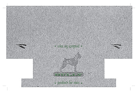
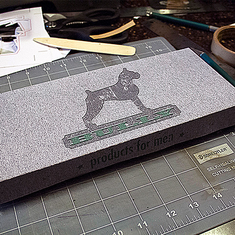
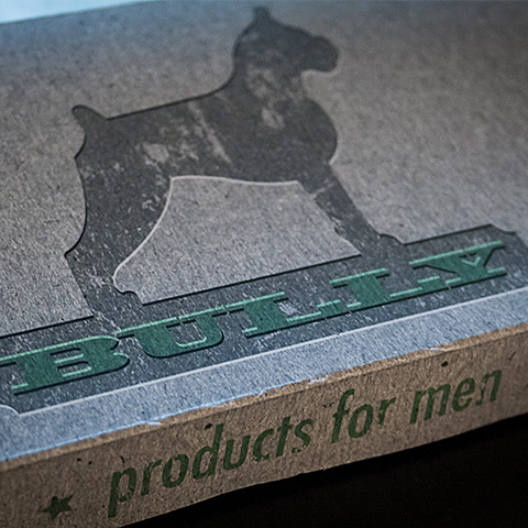
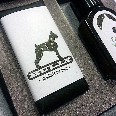
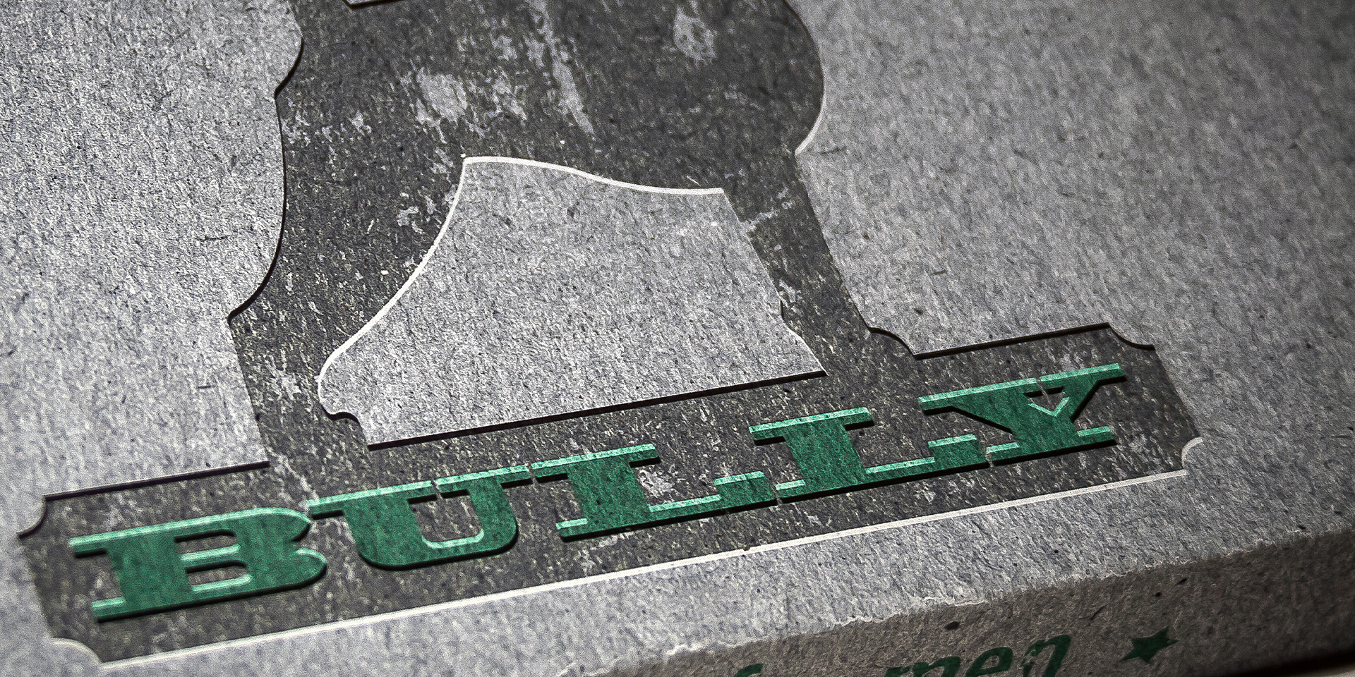
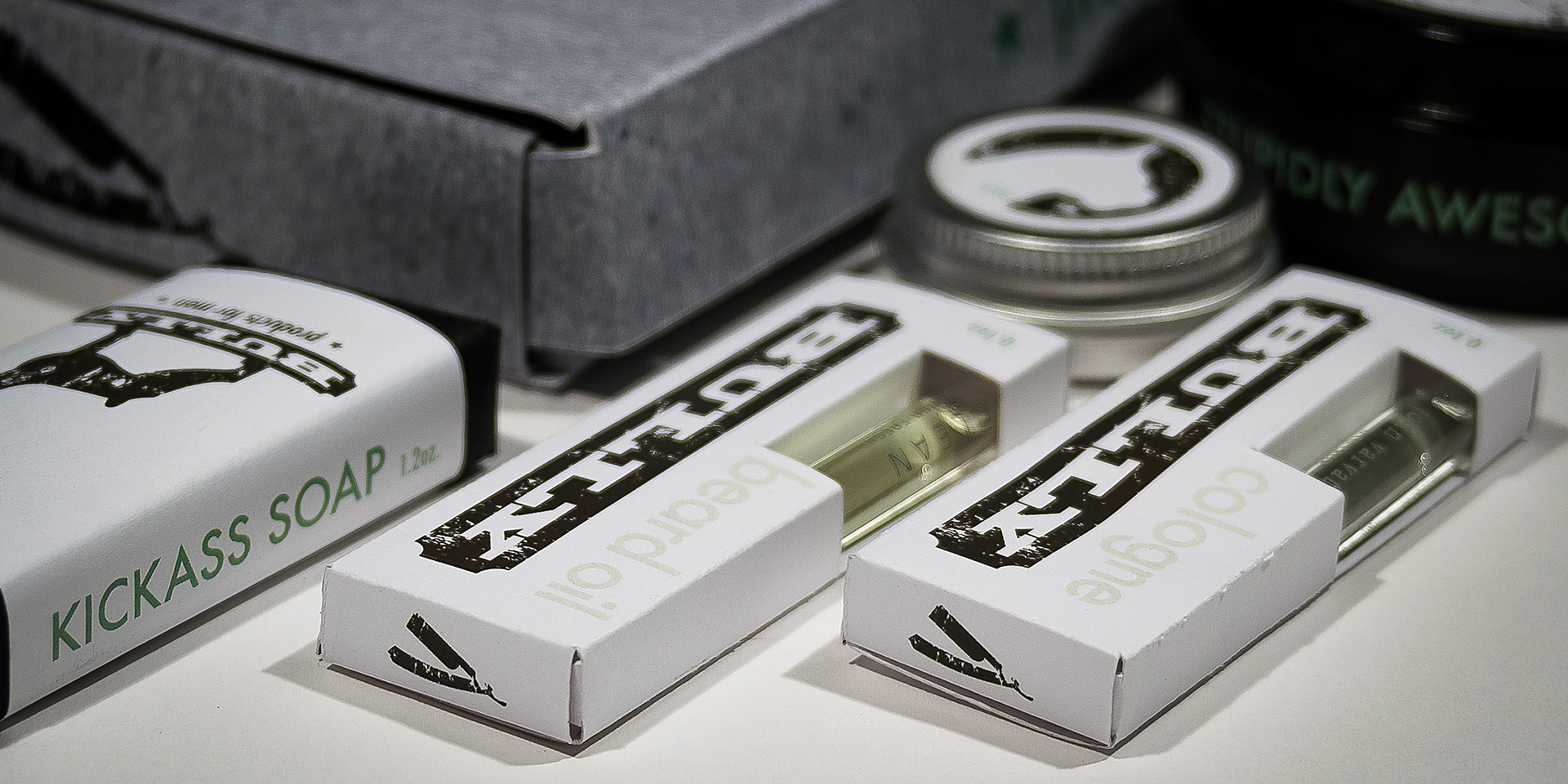
Bully is a men’s grooming concept brand crafted for the no-nonsense individual who values ruggedness and authenticity. This design study took inspiration from the bold emblems of 1950s work trucks, capturing the spirit of the blue-collar worker. Through extensive research, sketching, and logo development, the Bully identity was born—a symbol of resilience featuring a Boxer as its emblem.
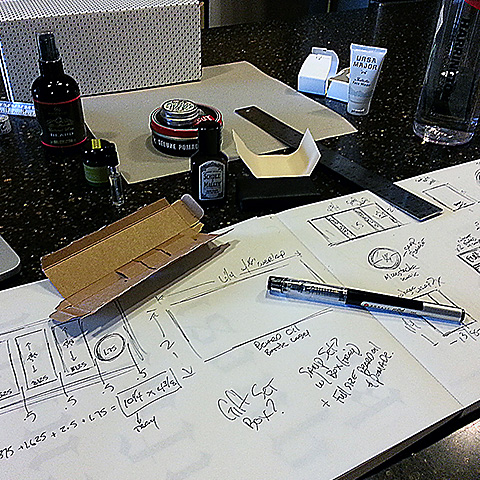
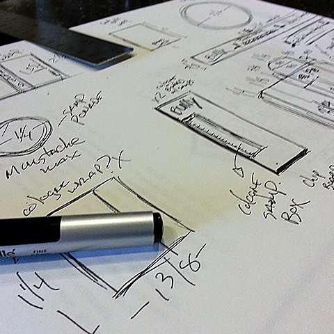
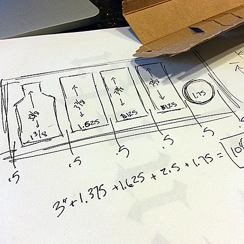
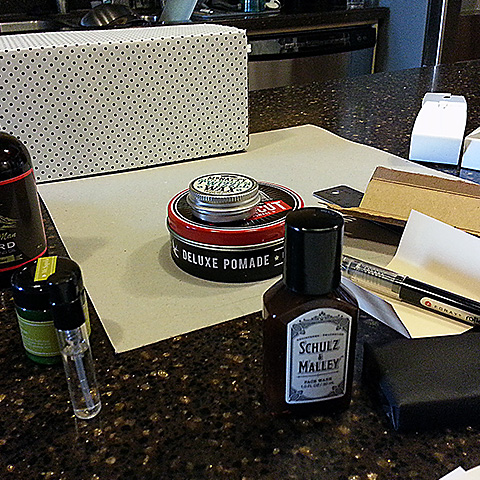
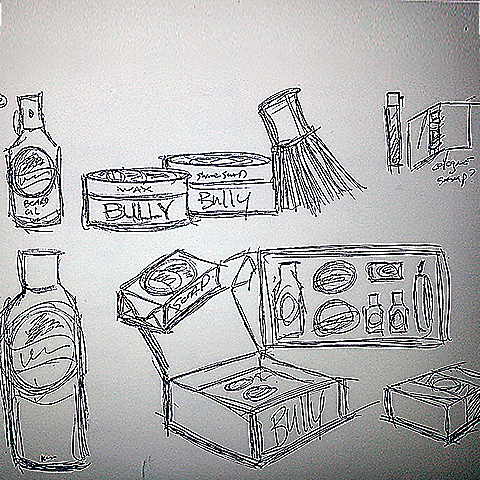
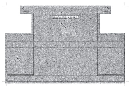
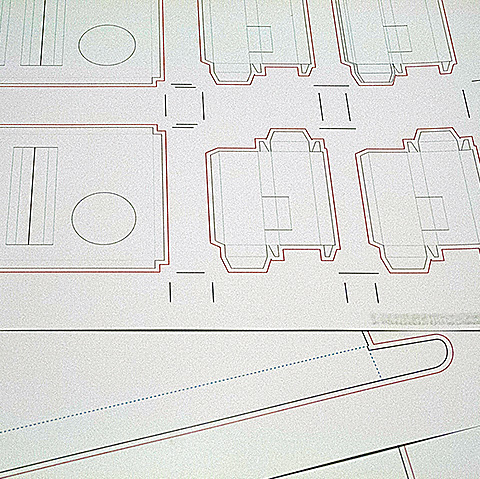
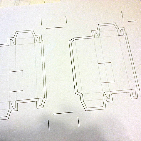
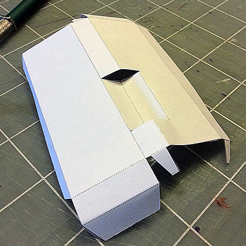
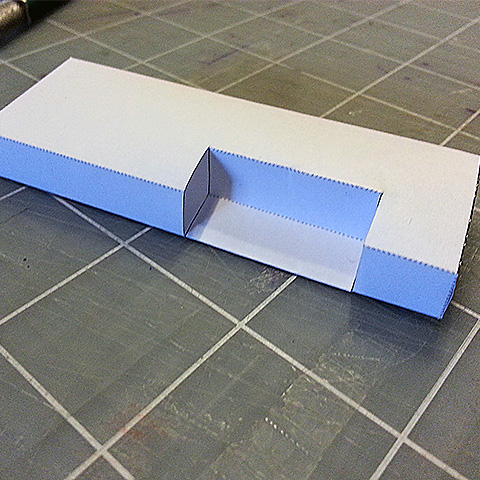
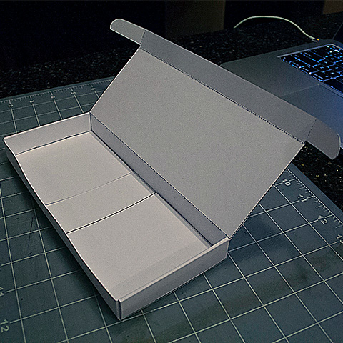
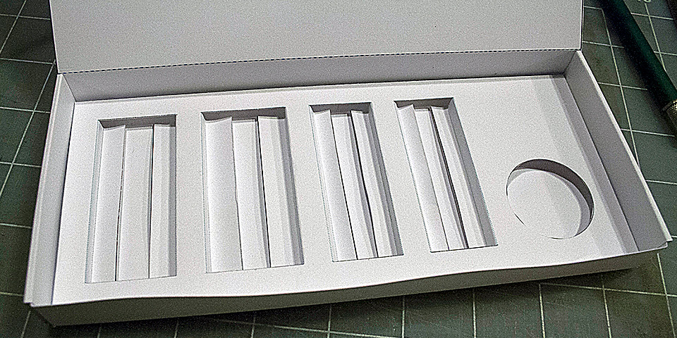
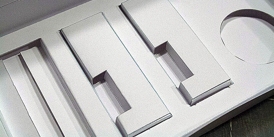
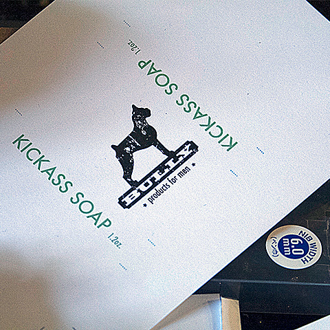
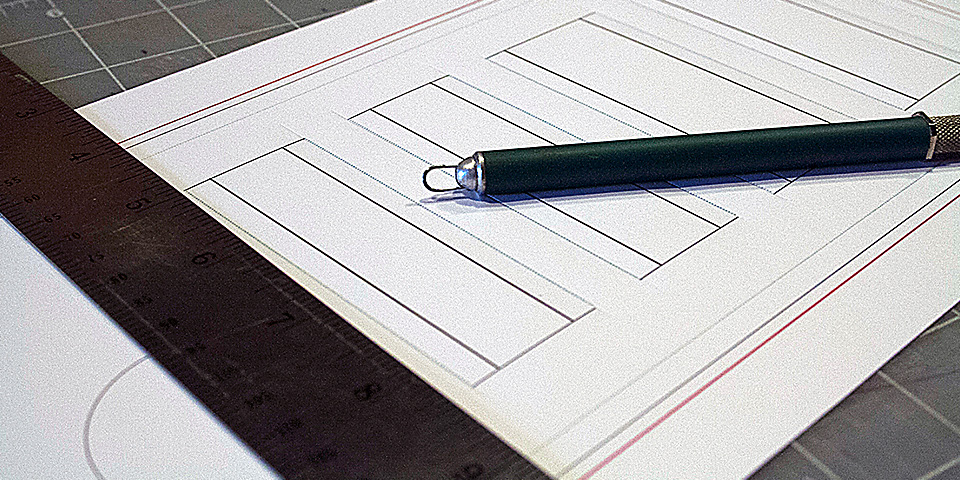
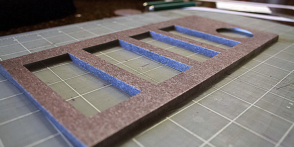
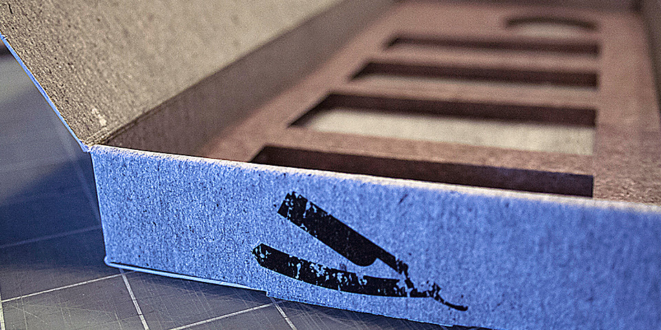
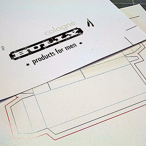
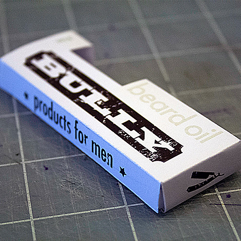
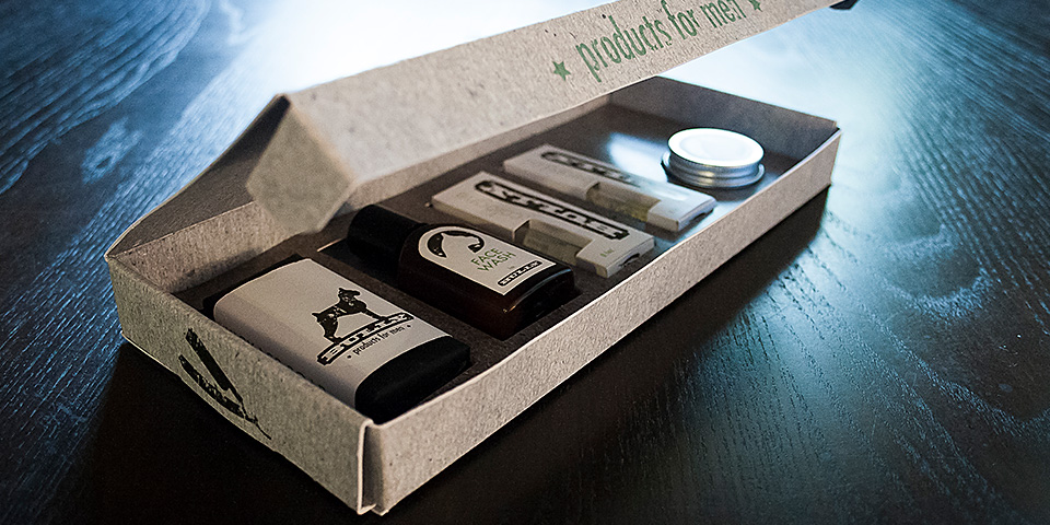
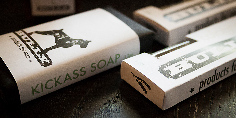
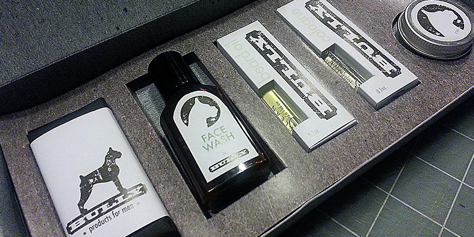
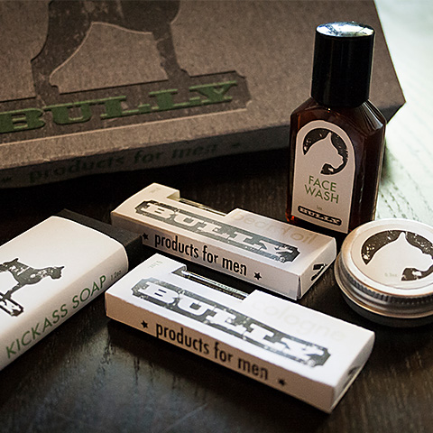
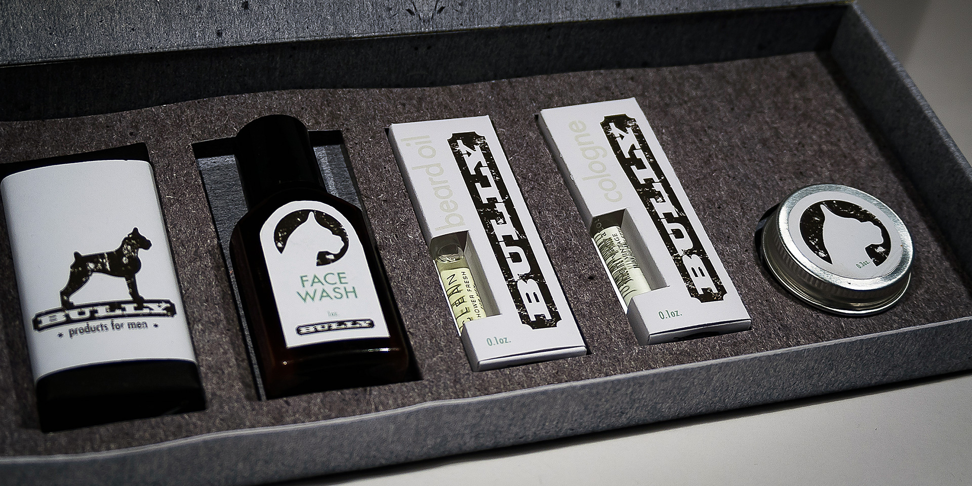
The packaging design is minimalist yet impactful, featuring embossed greyboard for a strong, durable look. With black-and-white labels punctuated by a vibrant green logo, the aesthetic is both bold and functional. Packaging comps ensured every detail aligned with Bully’s vision, and final product photography highlights the textured, understated power of the design, reflecting the grit of the Bully lifestyle.
Embodying the energy of old-school barber shops and classic Americana, Bully’s “super awesome hair grease” and “kick-ass soap” embrace raw, unapologetic style. This design celebrates resilience and strength, creating a brand that’s more than grooming—it’s a lifestyle for those who value substance with a bit of grit.