1836 Hardscrabble was envisioned as a nonprofit organization that would celebrate the cultural roots of Chicago’s Bridgeport neighborhood, originally named Hardscrabble in 1836. The idea focused on fostering visual arts education, empowering local artists, and creating a community platform to celebrate creativity. Though it never took shape, the concept aimed to honor the neighborhood’s history and the resilience of its artist community.
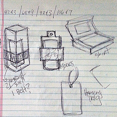
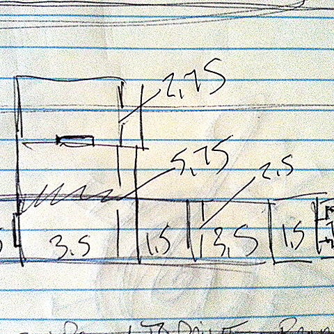
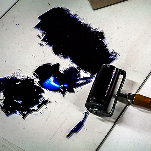
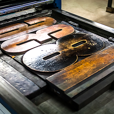
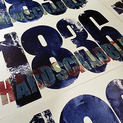
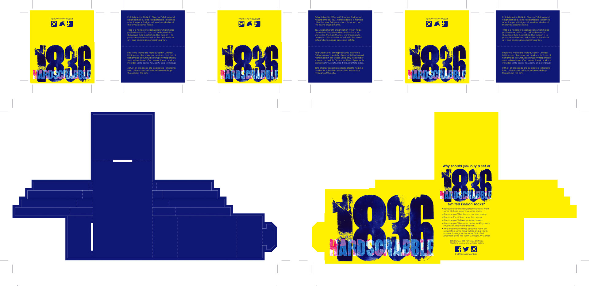
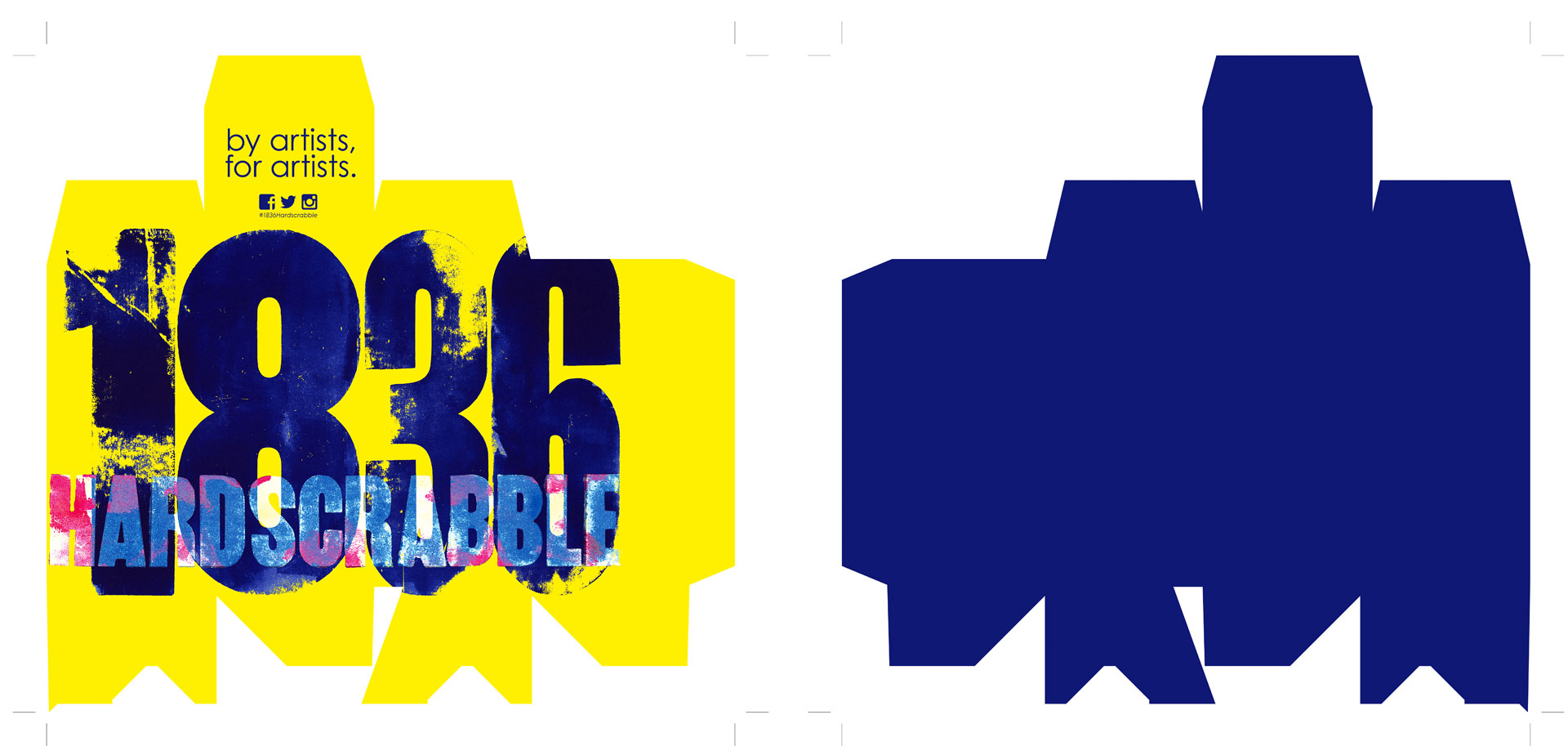
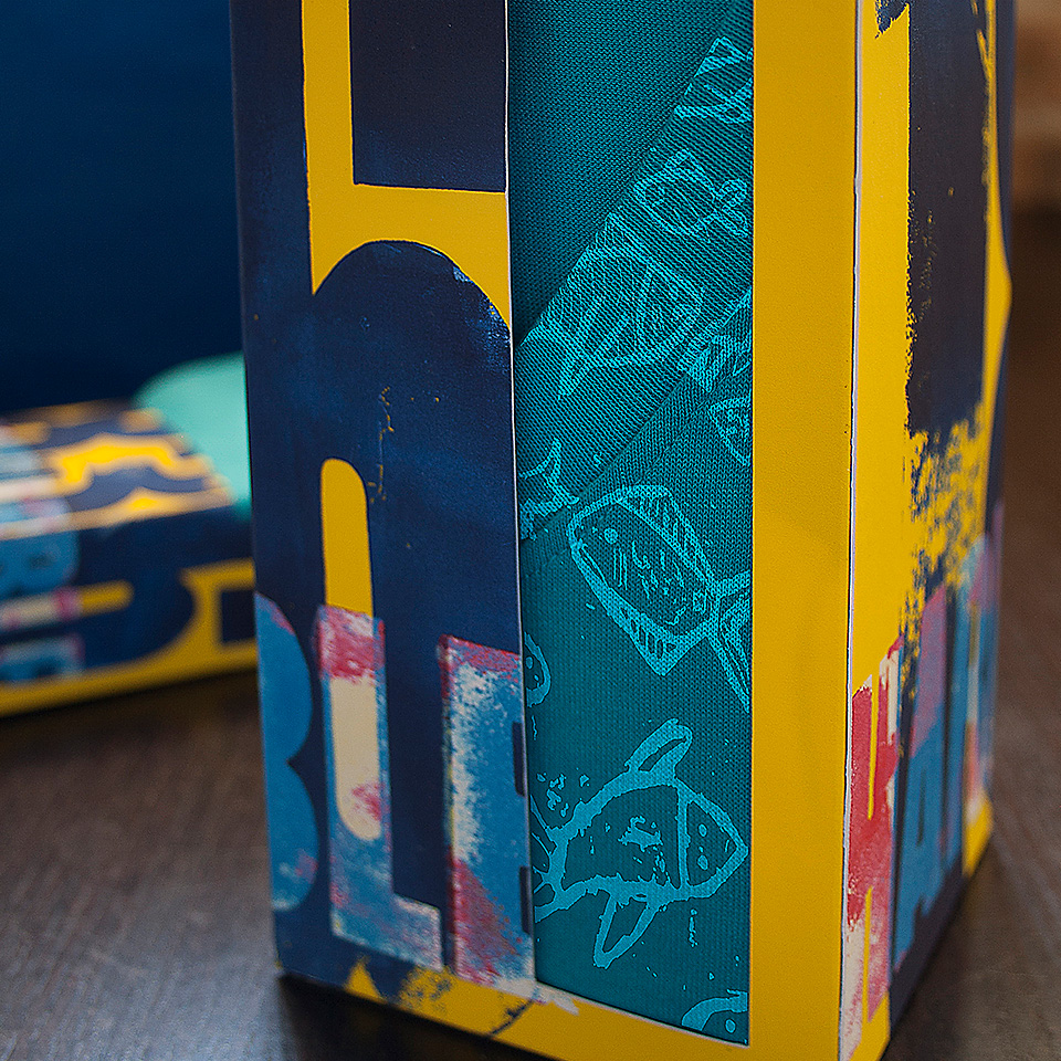
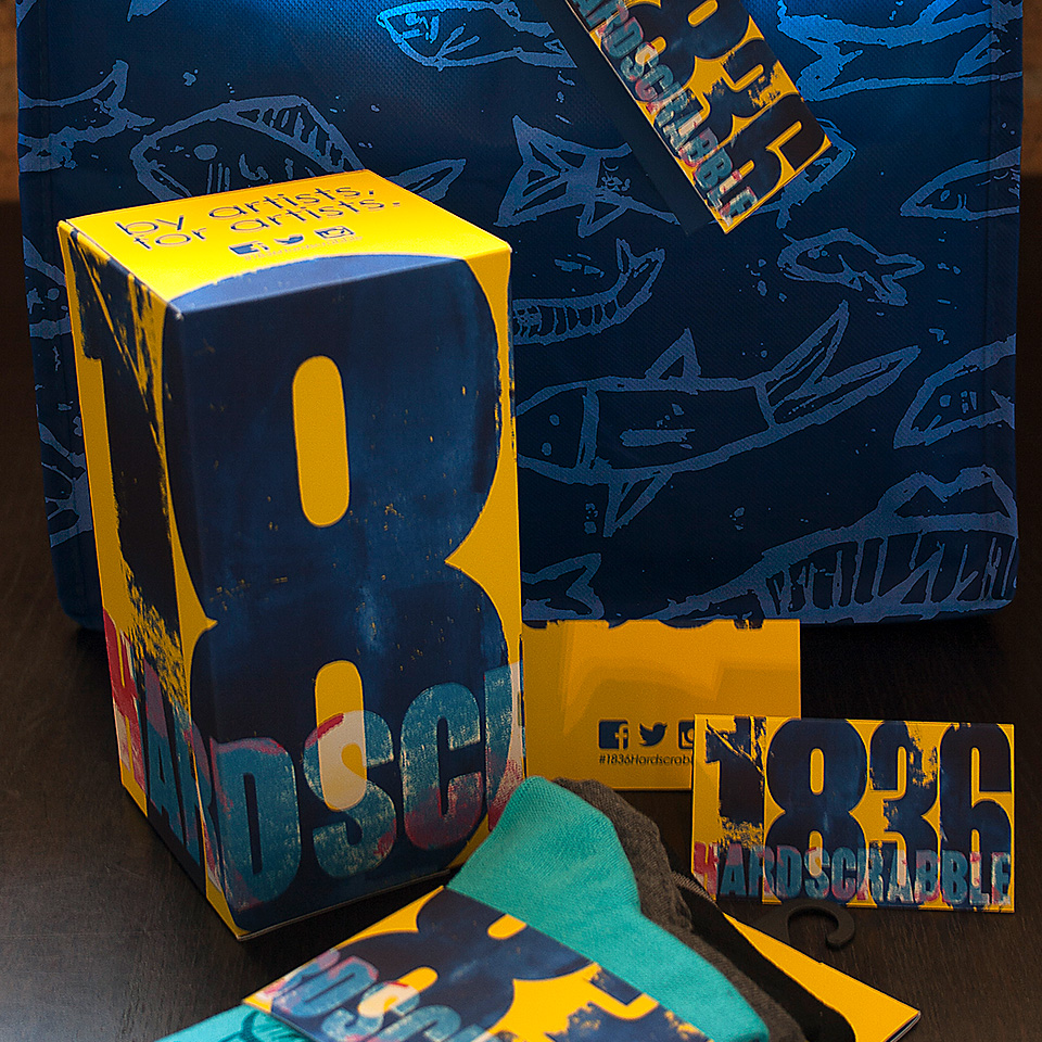
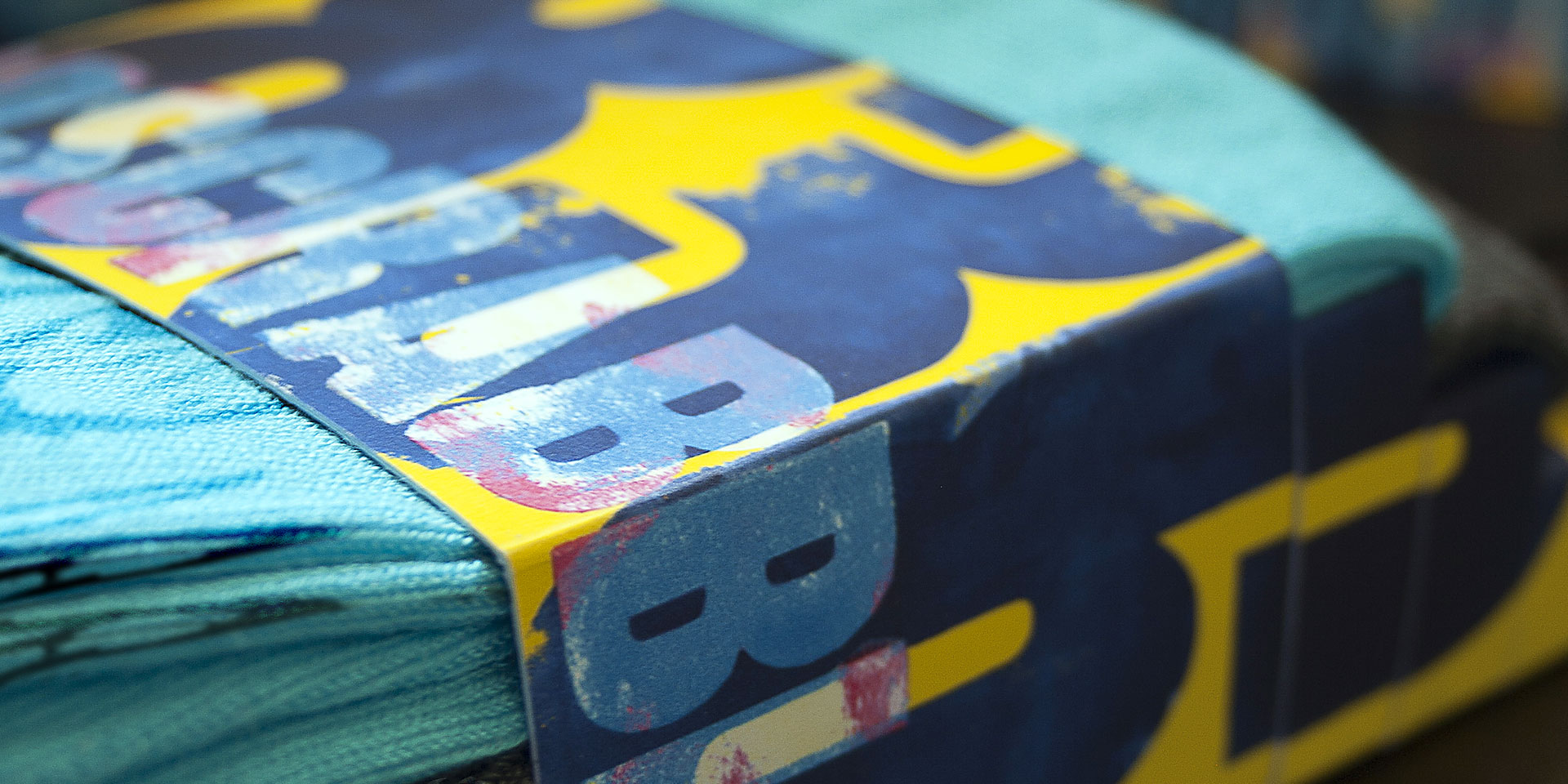
My ideas for the logo and packaging were inspired by traditional letterpress printing techniques and featured vibrant colors to reflect the project’s energetic spirit. The branding was developed to showcase limited-edition, handmade items, including shirts, socks, ties, belts, and tote bags, each designed to feature the work of local artists and transform everyday items into wearable art. This design was meant to be an accessible, visually striking representation of the neighborhood’s creativity.
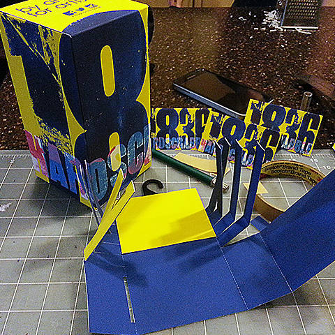
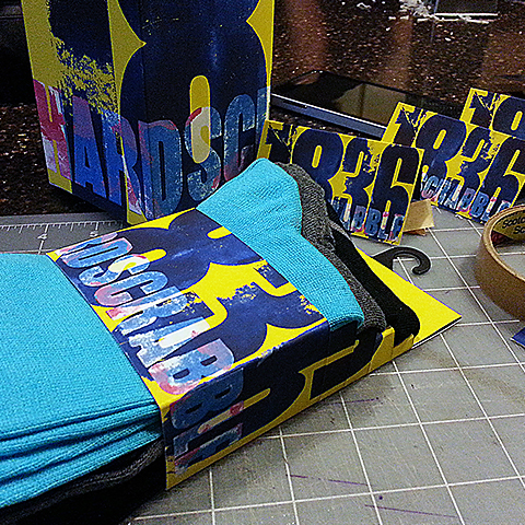
Though only conceptual, I completed the packaging comps and product photography myself, capturing the intended aesthetic of the brand—bold, community-centered, and celebratory. The vision of 1836 Hardscrabble stands as a tribute to the heritage of Bridgeport and the creative spirit of its artist community.