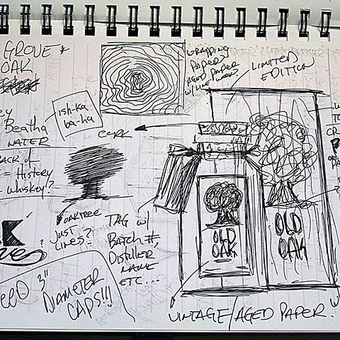
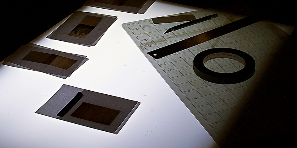
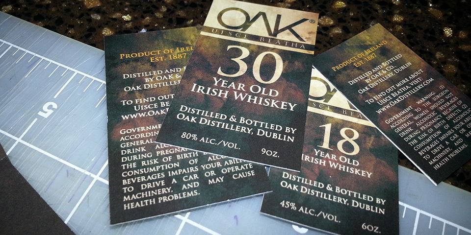
Oak Whiskey is a conceptual project rooted in family legacy, Celtic tradition, and the timeless allure of "uisce beatha" — pronounced "Ish-Ka Ba-Ha" — meaning "Water of Life." Inspired by Gaelic heritage, this whiskey design honors rich symbolism and generational stories. Research, illustration, and sketching played crucial roles in capturing the essence of this legacy, weaving visual narratives into every element, from a custom typeface steeped in history to detailed line work echoing Ireland's landscape.
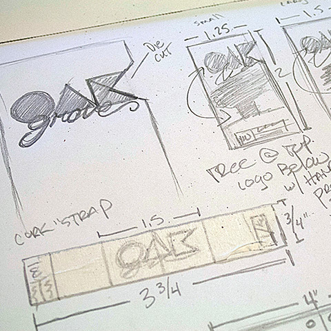
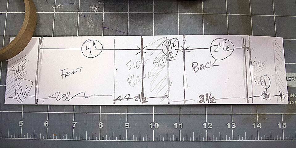
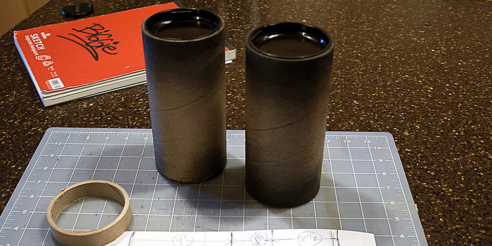
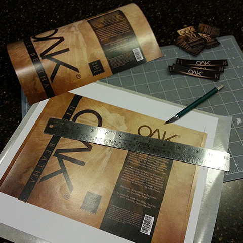
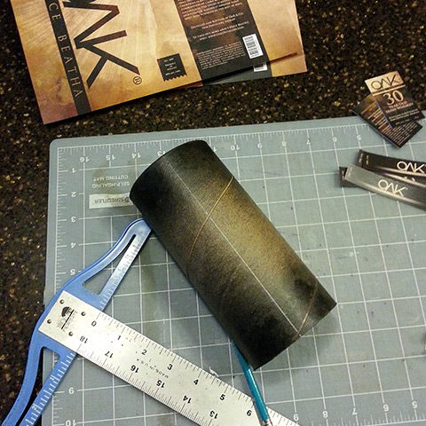
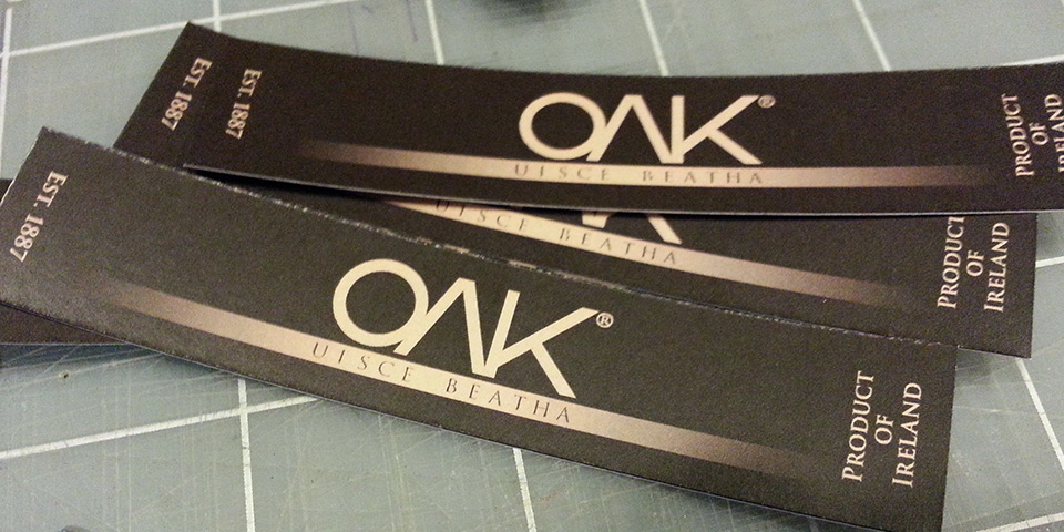
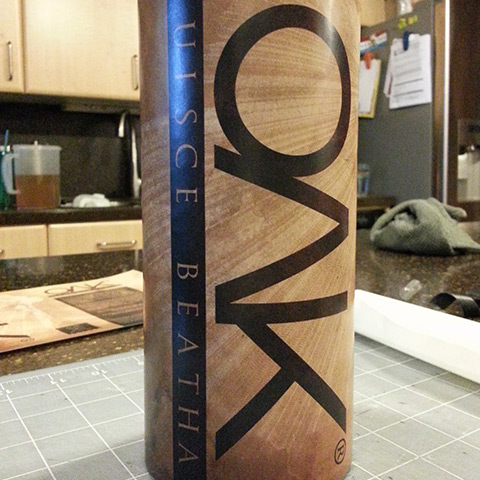
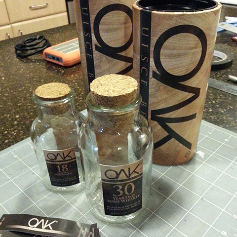
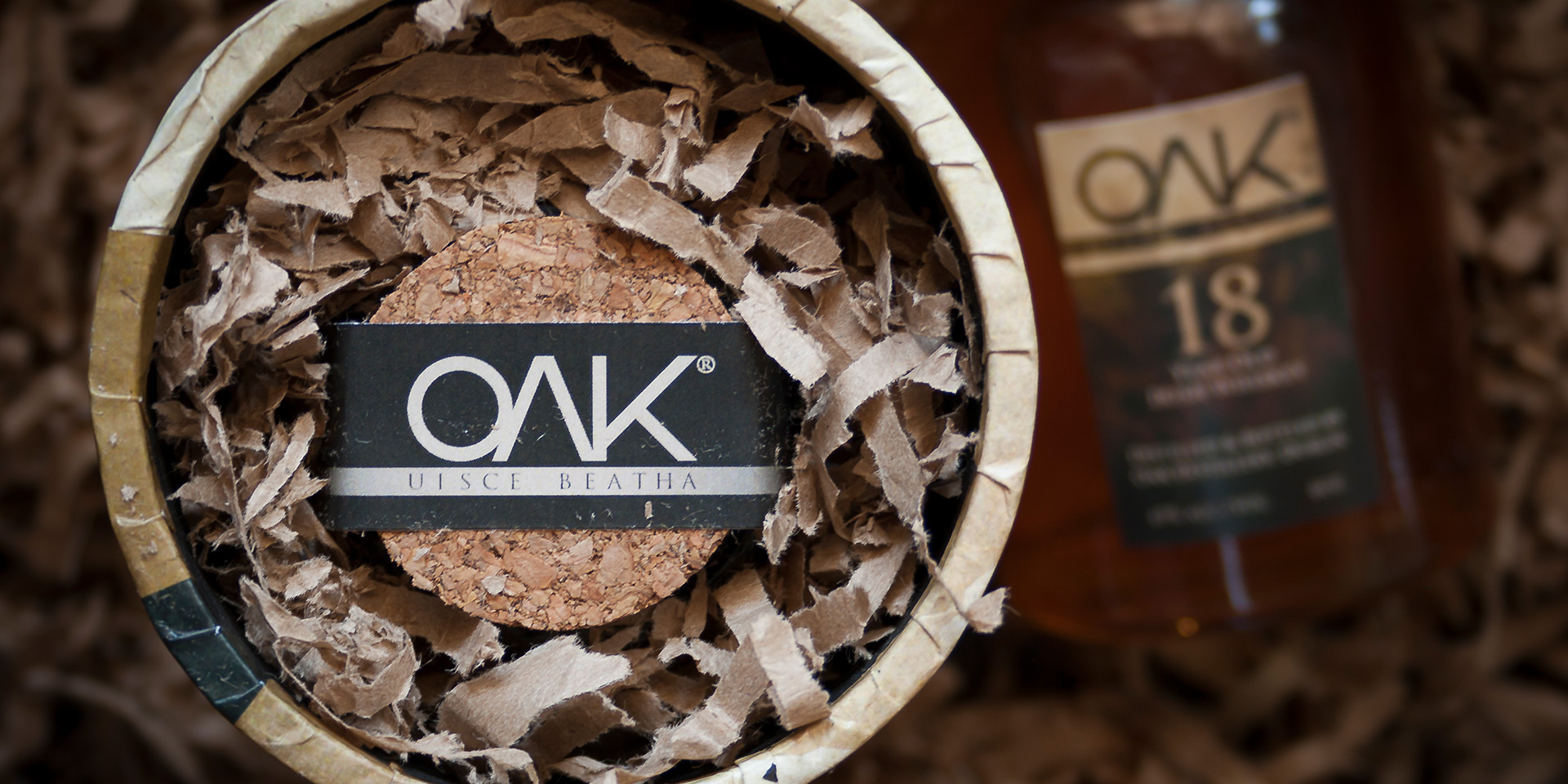
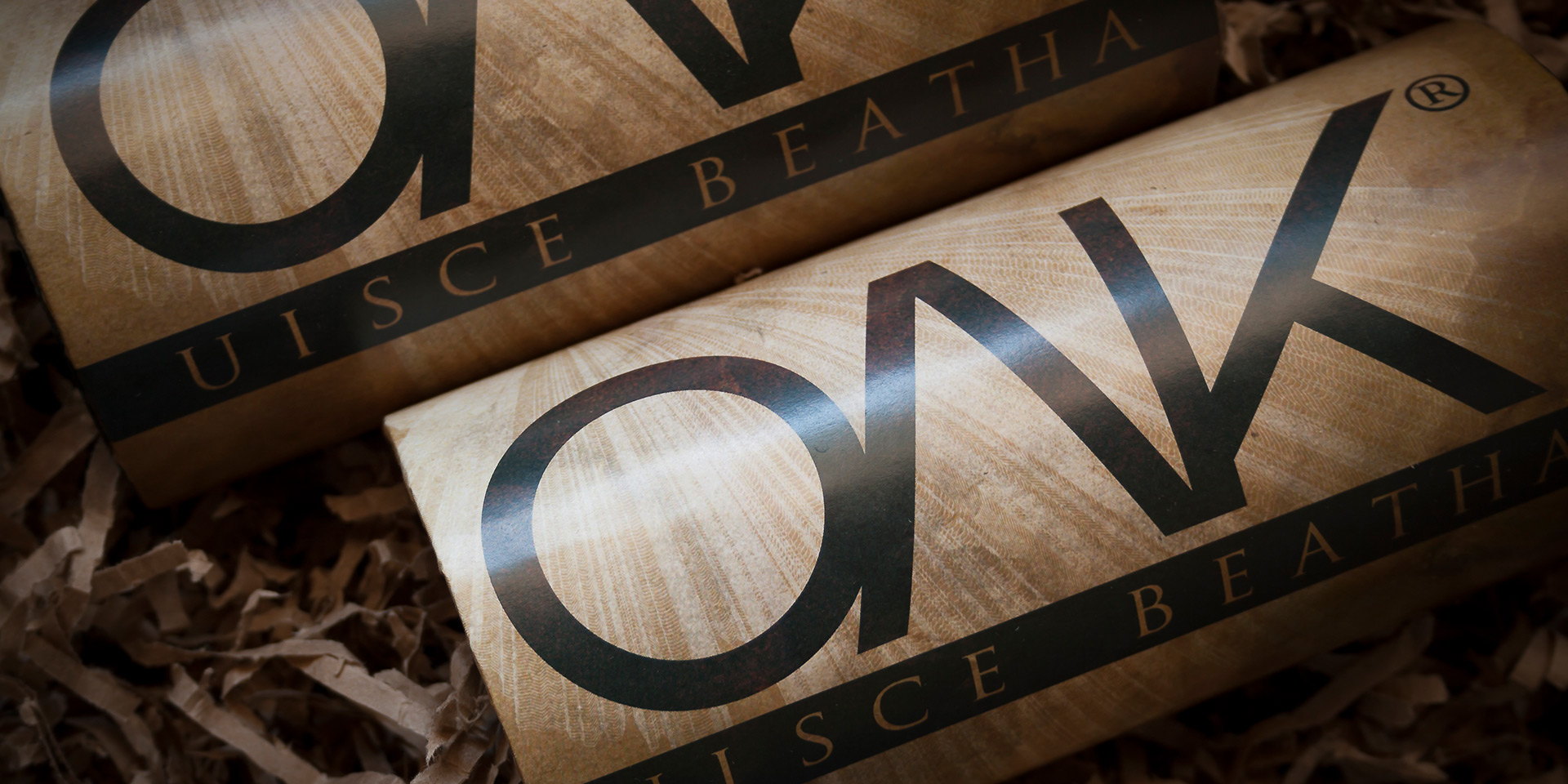
The oak tree, a central emblem in Celtic culture, became the heart of the branding. Known for symbolizing strength and wisdom, it graces the logo design and embodies the family crest, bridging past and present. Building packaging comps was an essential part of the process, ensuring that the design conveyed warmth and heritage. The deep, rich colors of the package design further evoke the richness of whiskey and the lush landscapes of its origin.
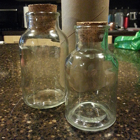
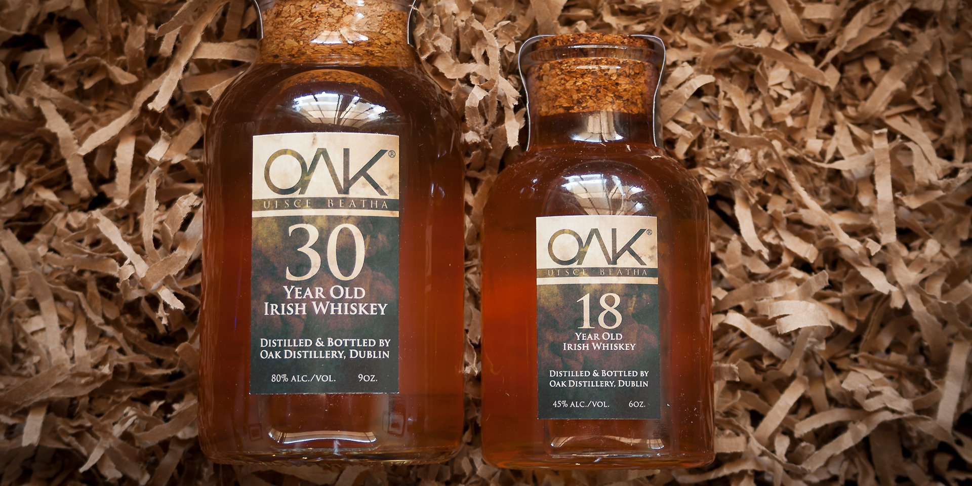
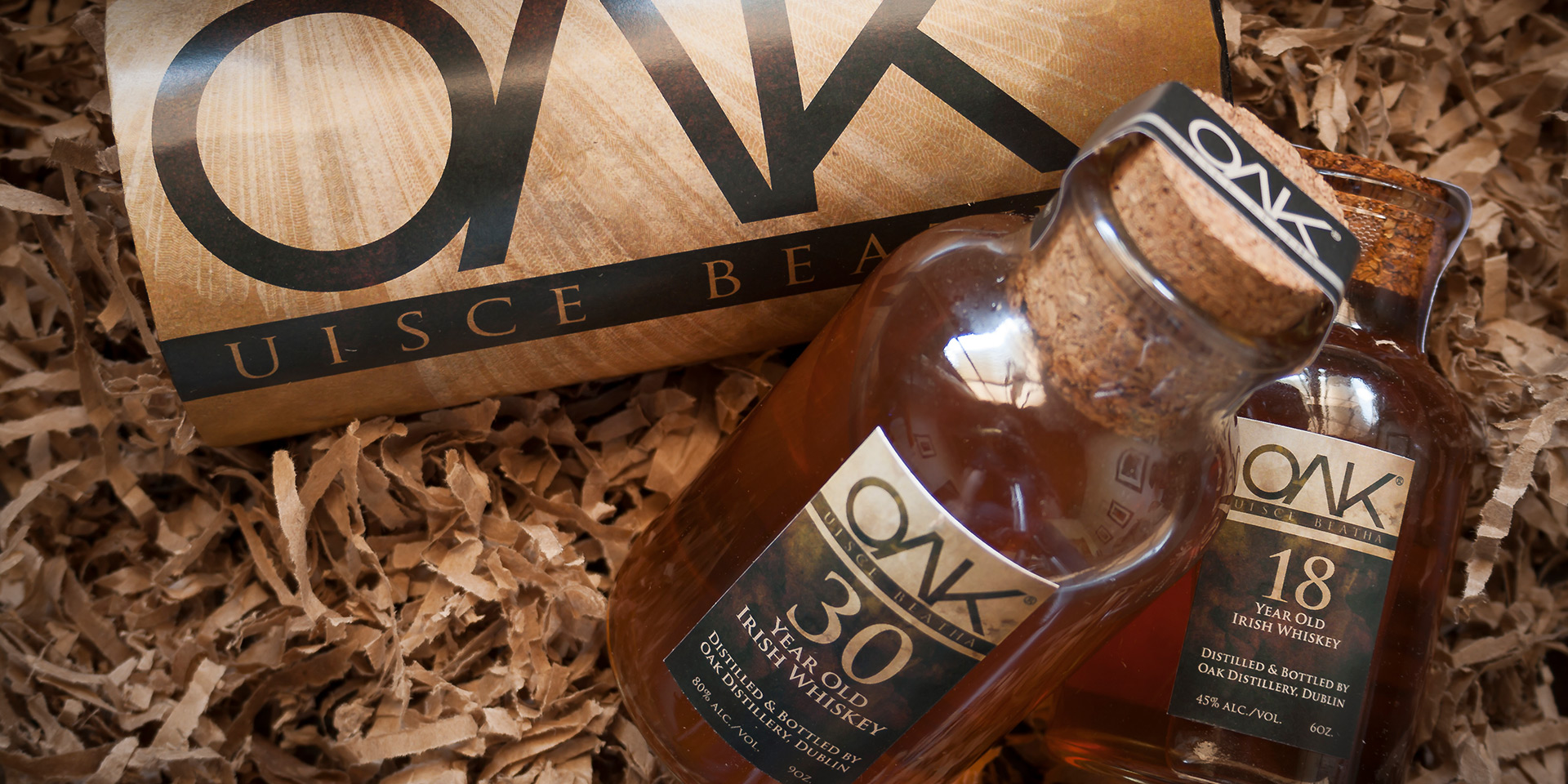
Photography was used to showcase the product's premium feel, capturing the refined elegance of each bottle. The entire visual identity, from logo design to package aesthetics, celebrates the warmth, tradition, and craftsmanship of Oak Whiskey. It’s a tribute to a proud heritage, imagined with care and attention to detail for a purely conceptual client. Sláinte!